
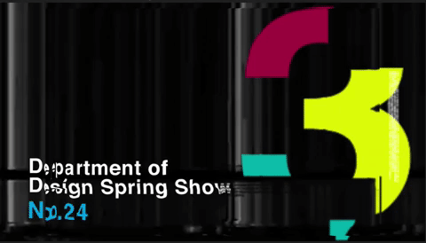
As seniors in the Graphic Design program at Sac State, Professor Lauren Kelly tasked us with a redesign for the 2021 Department of Design Spring Show. This assignment presented a unique challenge as we were designing for an event with new circumstances and challenges that previous Spring Shows never faced. The members of our group for this project consisted of Alex Keith, Elizabeth Keeling and John Stawiecki. Since we had all three enjoyed designing wayfinding for a previous case study on our own in this UX class, we opted to put our collective heads and unique skills as design students together to develop wayfinding, concept, and branding for the 2021 Department of Design Spring Show. This assignment also presented us with the opportunity to develop our experience in designing wayfinding, documenting our research, process, and final outcomes.


The Department of Design Spring Show is an annual exhibition showcasing the best work of graduating seniors as well as many undergraduate students from the programs of Graphic Design, Interior Architecture, and Photography from Sacramento State University. It is a very important annual event attracting attendees from all over the region, and gives the opportunity for students to present, showcase, and celebrate all their hard work during their time at Sac State. The Spring Show provides a unique opportunity for all students and faculty to get together under the same roof at the same time and mingle, network, meet each other, and revel about everything design and reaffirm why we do what we do. It is also a place where past alumni can reconnect with professors and meet the new students, and a place where prospective employers and the design community in the greater Sacramento region can get a first-hand look at the fresh new faces and talent in the design world.
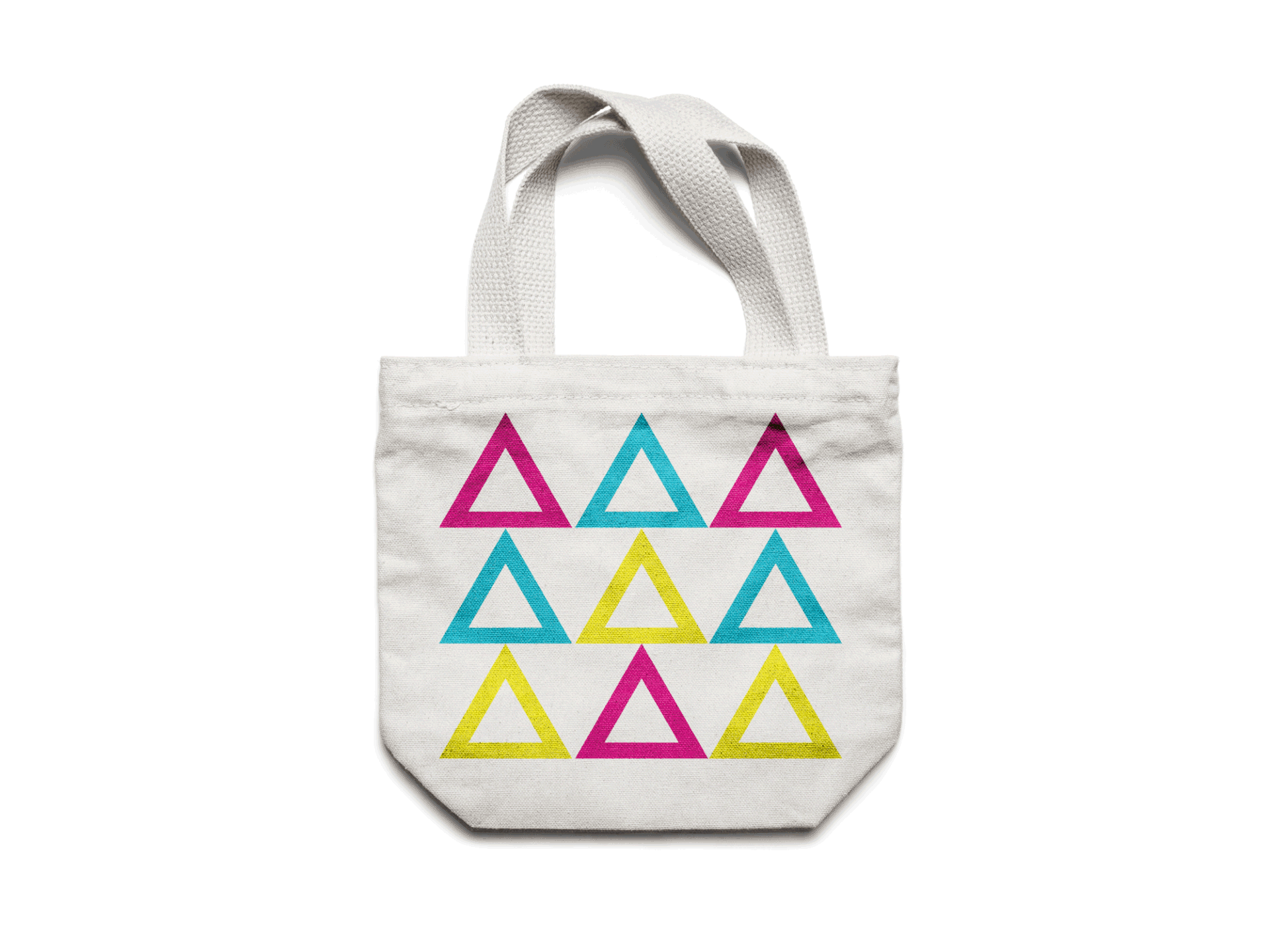
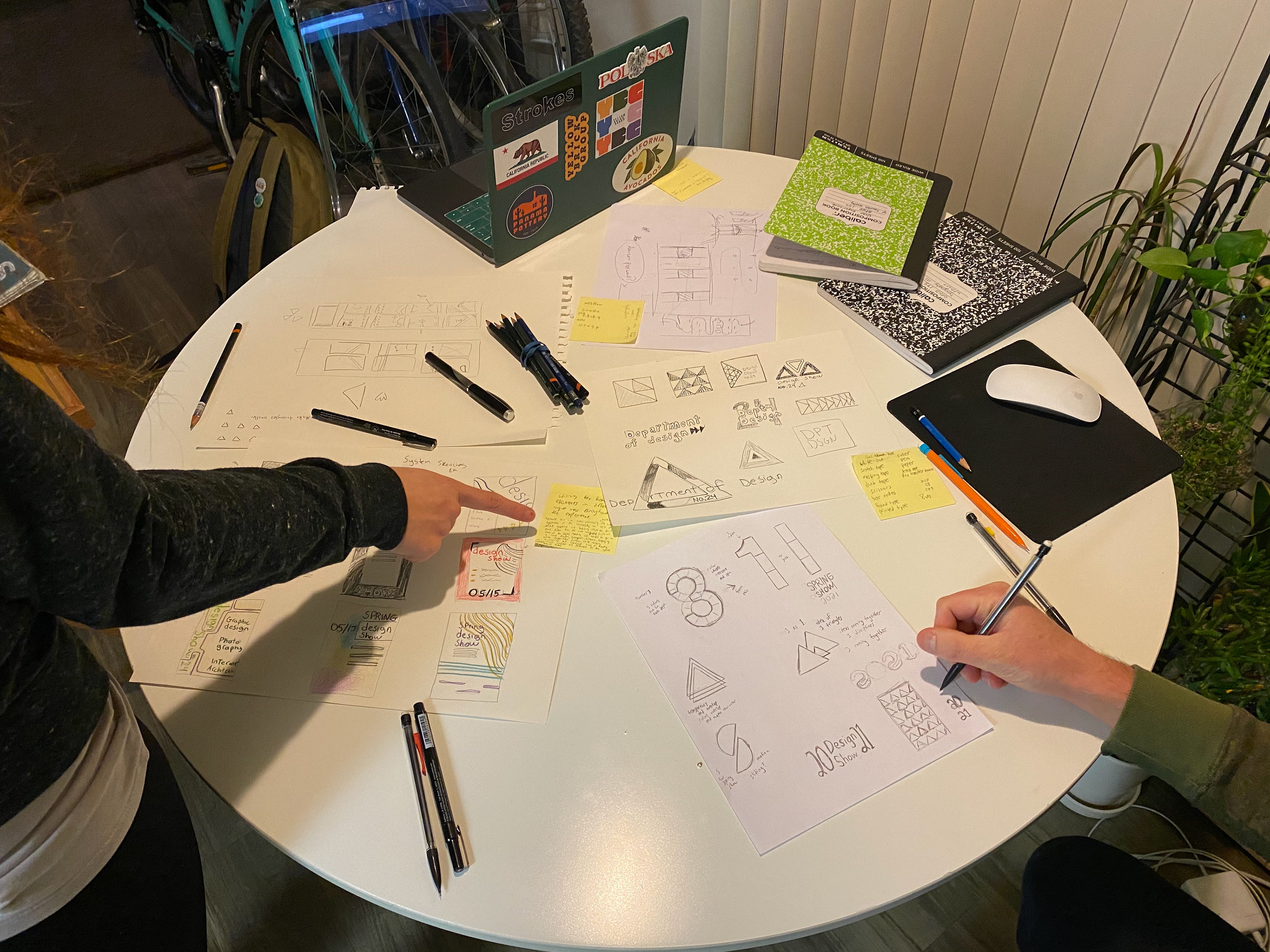
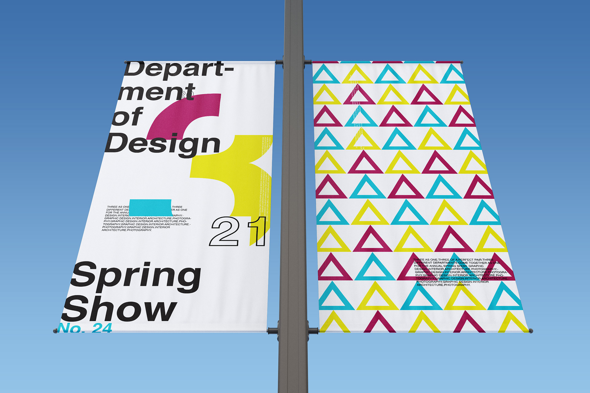
Our concept was inspired by idea of the three disciplines of Graphic Design, Interior Architecture, and Photography coming together as one, for one night, in one place. As different as those three disciplines are, they all share the similarity of creative arts in the Department of Design in the College of Arts & Letters at Sacramento State. This led us to a recurring theme of three as one. We began exploring the concept and idea of three in the graphic style and feel of our wayfinding through our color palette, shapes used, typography, etc.
Because this is an event showcasing work from the creative departments of the University, the visual and spatial arts that reside at the intersection of art and cutting-edge technology, we felt it needed graphics and branding style to suit and reflect that. Rather than the more corporate or traditional look and feel of Sac State's branding as a whole, we needed to go in a more playful, energetic, dynamic, engaging, innovative, almost experimental direction, while remaining professional and cohesive and serving the work showcased in the Spring Show. One of our many goals was to create visual interest and excitement for this special and important annual event.
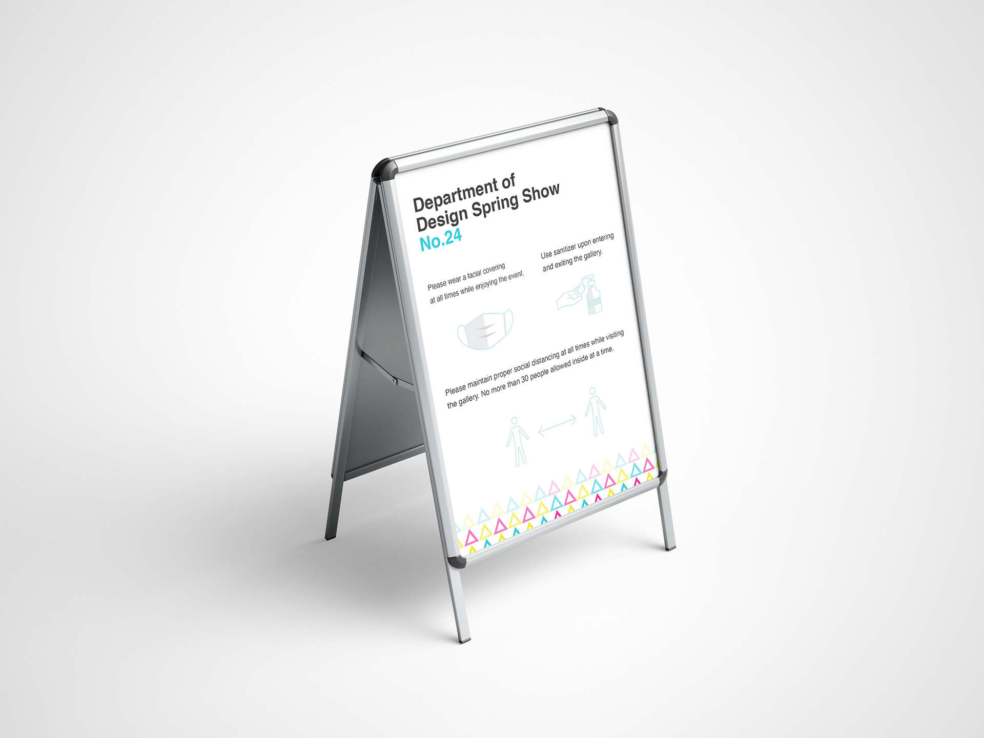
The Spring Show is normally held at the University Union Ballroom on the Sac State campus. It is an enormous room with ample space for tables and exhibitions for each student work along with places to mingle. Due to the COVID-19 Pandemic, holding the Spring Show on campus is not a possibility. Instead the show this year will take place in a the much more intimate space of the Axis Gallery on S St. in downtown Sacramento. Rather than view this as an obstacle, we have embraced the limitations presented by this much smaller space and have attempted to design a show with this space in mind by having a touch-less, socially distanced, one-way traffic experience.
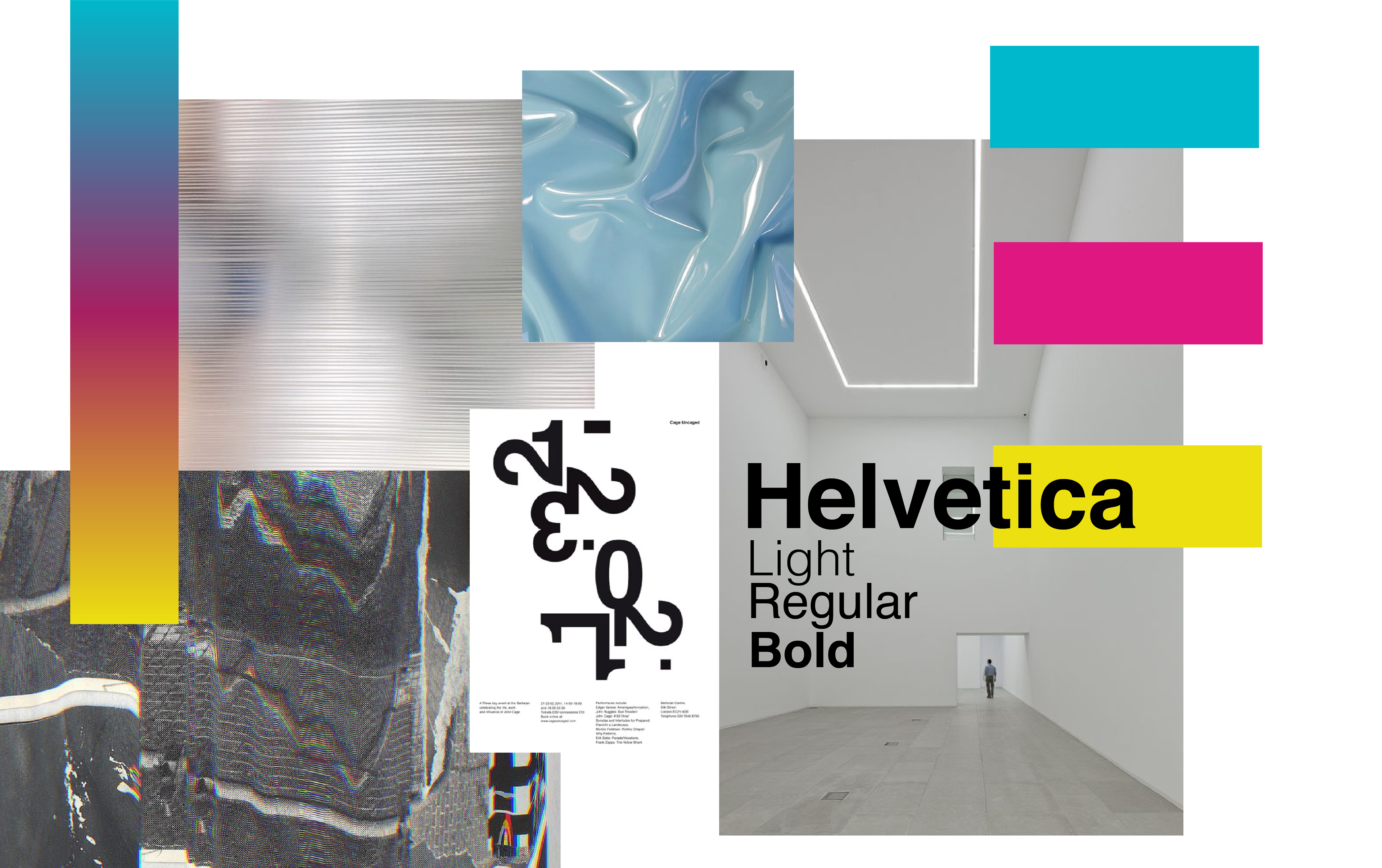
This mood board depicts ideas and elements from our research which included a site survey, creation of proto-personas, triads, and a comparative assessment. Early on we felt it was important to reflect the three disciplines as three distinct entities, but connected. We wanted to incorporate a CMYK color palette. By using three colors we could represent the three disciplines. We also wanted a modern feel with a sans-serif font and to incorporate digital glitch patterns for a new and exciting feel that ties together and blends technology and art.
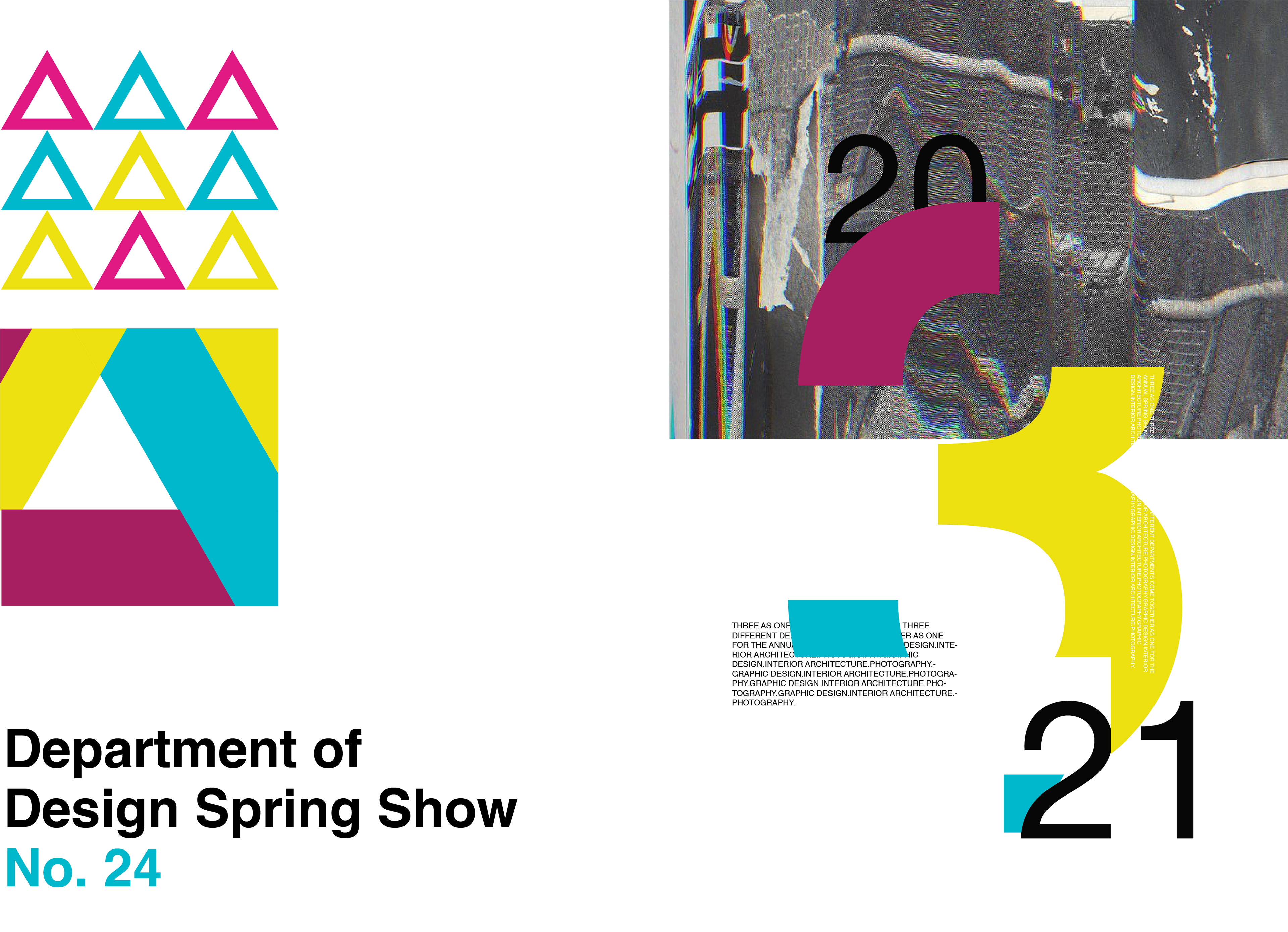
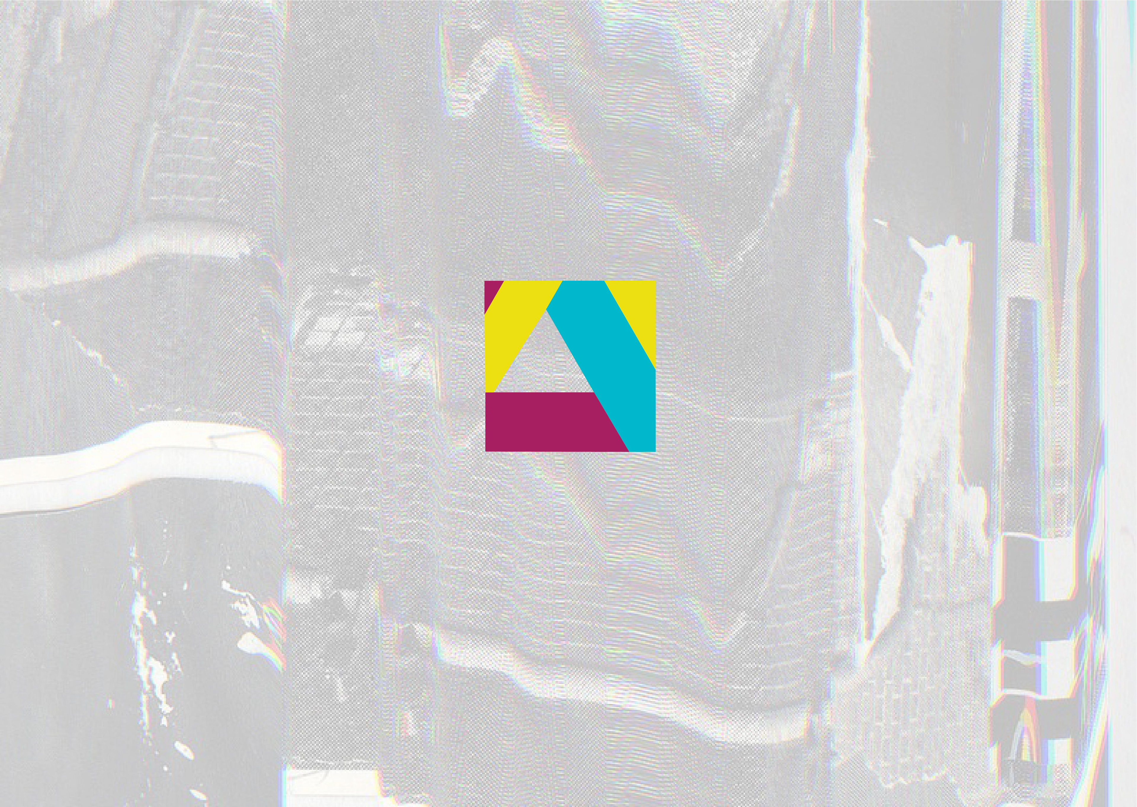
Our logo is meant to work and reference in different ways the three disciplines. It references parts coming together to create a whole that’s more than the sum of its parts, an essential Gestalt Principle graphic designers are familiar with. It also works as an abstract aperture and shutter to reference photography. And it also represents architecture by invoking one of the essential structural elements of architecture, the A-frame. This design also enables us to use it on its own or in conjunction with type, or simply break it apart into its separate elements.

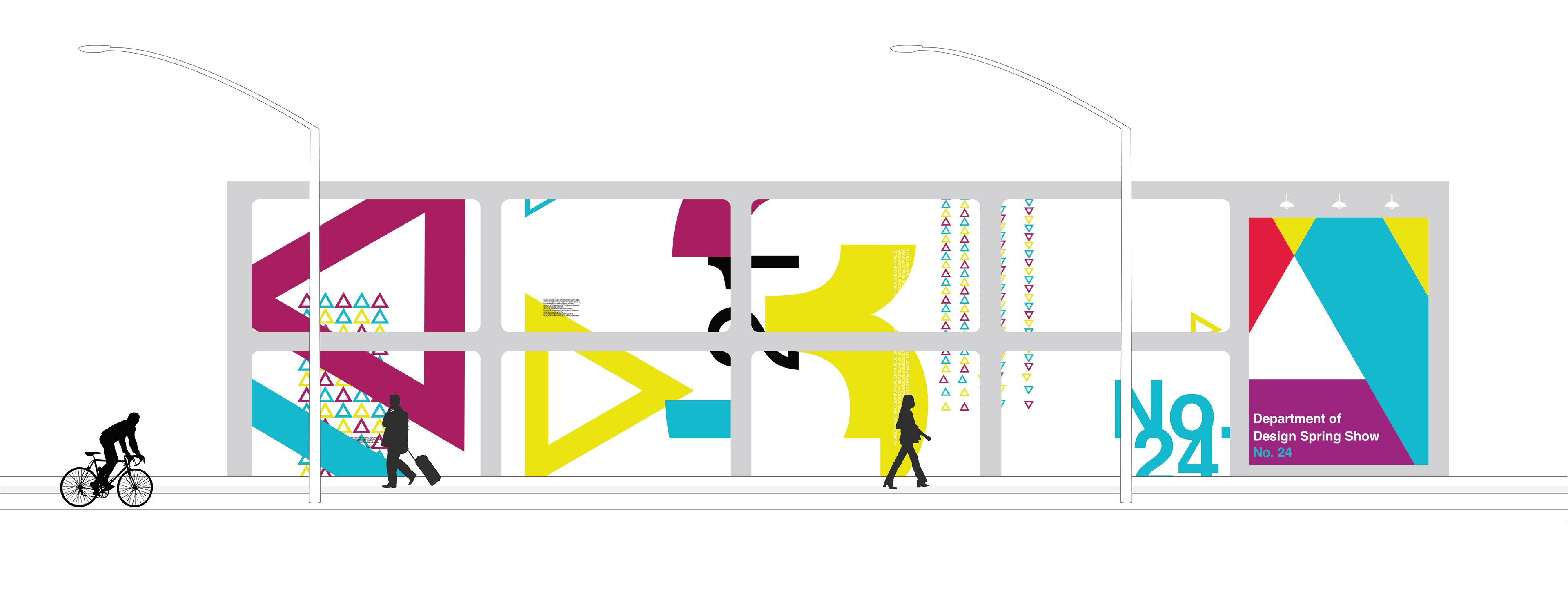
Our goal for designing the exterior of the building was to make it eye-catching and memorable even from a quick glance. Unlike the multi-colored facade that the building exhibits now, our vision for the building was to paint it white to give it a clean-look reminiscent of the influential 20th century architect Mies van der Rohe and his design concept of: "Less is more." This also follows our main brand identity and allows for the striking colors and bold typography of our wayfinding and signage to stand apart from the structure, but also subtly compliment it. Some of the key words we wanted our audience to take away from a street view as they approach the building was: innovative, fresh, safe, and exciting.

On the south-facing facade of the building, we plan to install eight built-in LED display screen that will be designed into the existing structure. They will display our color theme and any related messaging for the Spring Show as well as showcase student projects throughout the semester. Motion graphics will be incorporated to draw attention to the building, so our visitors and onlookers will be entertained as they wait outside before being admitted.
One of the challenges of this project and something we tried to keep in mind during the design process was to create a cohesive brand for the show, a memorable event with a consistent message and feel, while making sure the student work is the focus. One of the ways we tackled this was to integrate the student work and branding element within the concept through the use of digital screens in and outside the building so they work together and feel as natural as possible, and also provide a safe experience during the pandemic. Serving the work while being innovative and cutting-edge. We also wanted to make sure we give each discipline in the show equal hierarchy, presenting them in different ways but without seeming to favor one over another. We accentuated the aspect of three distinct disciplines in the Department of Design at Sacramento State coming together for one show in our message, feel and graphic elements in order to create a fresh, memorable, safe, connected, and inspiring event and experience.
Check out the full case study here